

2013
Design Lead
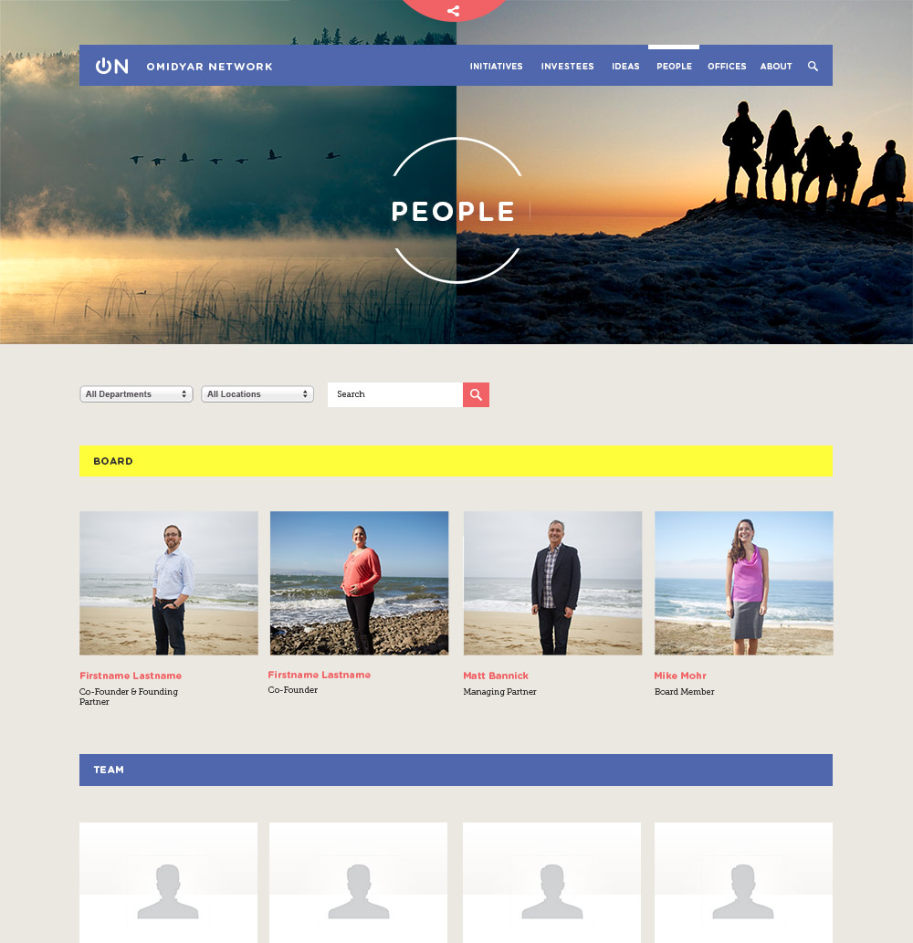
Omidyar Network
When Pierre Omidyar started eBay on a server under his desk, he probably wasn't thinking about global philanthropy. But by the time we worked with him, he'd long since sold the company and thrown his full weight behind The Omidyar Network — a philanthropic investment firm with an unusually ambitious goal: not just funding individual companies, but lifting entire sectors in parts of the world that needed it most.
The Network was entering its 10th year, and a refresh of its identity, web presence, and mission clarity had become a real priority. I led that work at Enso.
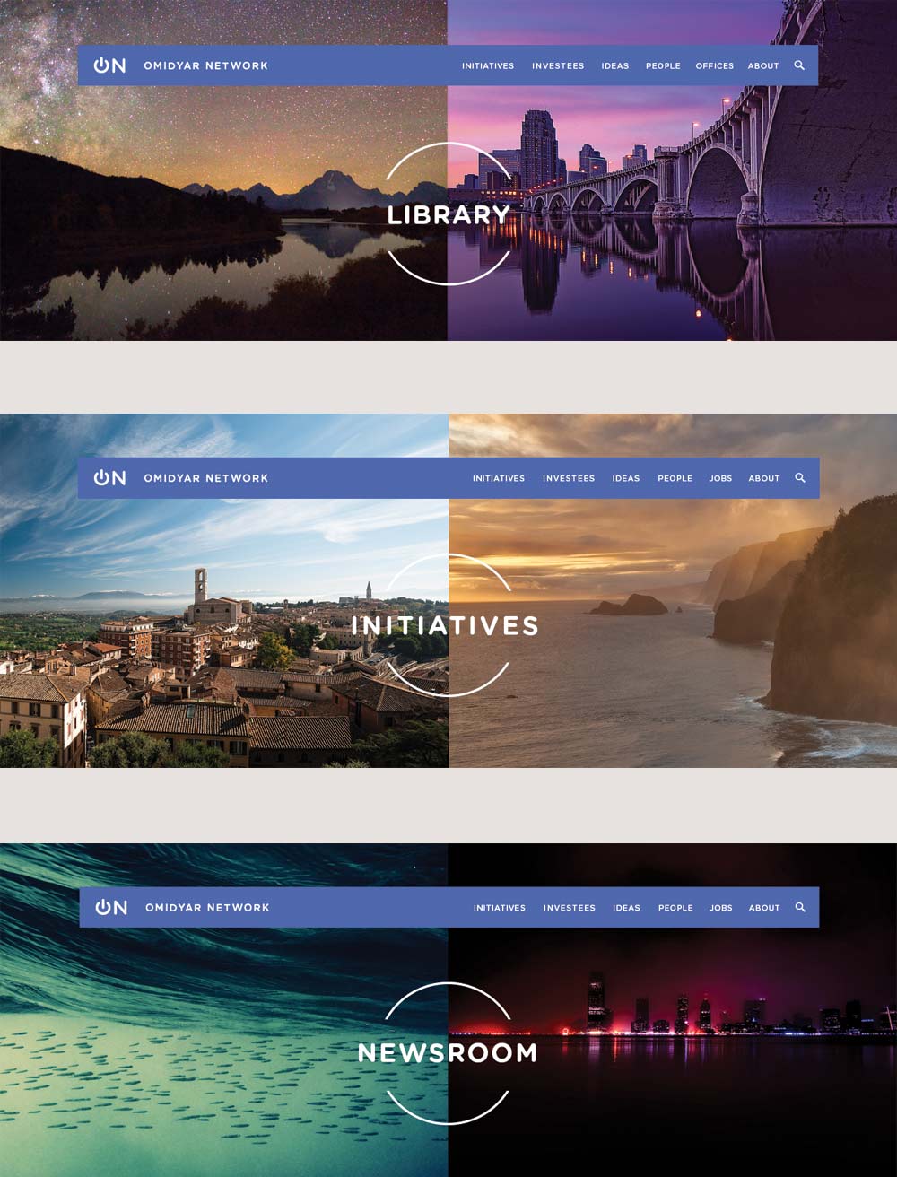
To begin, we took what we knew about communication goals and content strategy and loosely storyboarded the navigation and interior pages
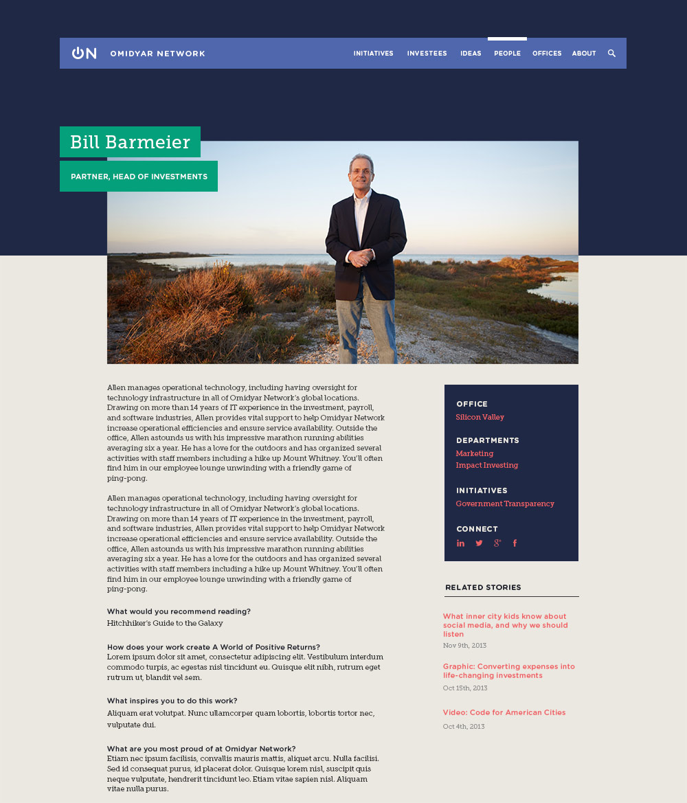
We knew the Network had several departments that would all need their own pages. Some would be more active than others, but all needed to be fed via the same CMS without breaking the design. Responsive, of course, so it became clear that we'd need a very modular approach.
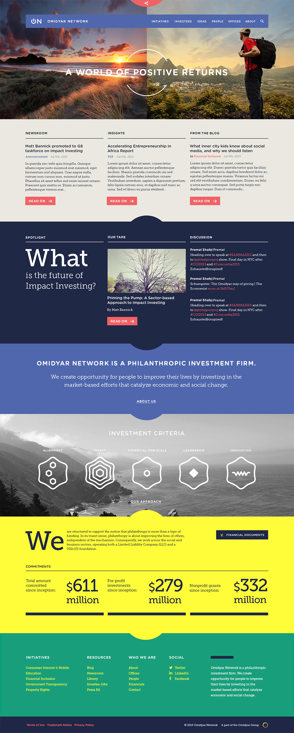
Once we had a sense of the structure, we moved into visual design. The Network wanted a site that felt both vast and tight-knit — a worldwide operation where everything still felt connected. We landed on aligning the horizon lines across all our photography, a subtle device that tied together images of wildly different people and places.
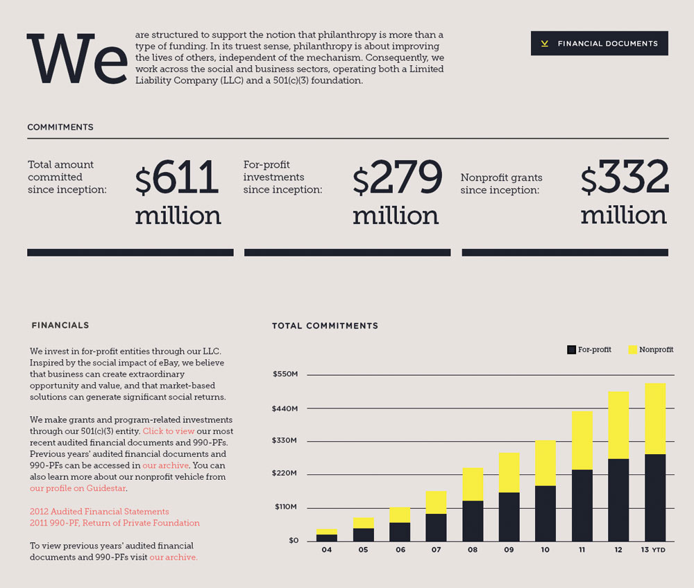
For typography I chose H&FJ's Gotham Rounded for its combination of approachability and strength, paired with Museo Slab — a sharp, readable serif that holds up well against it.

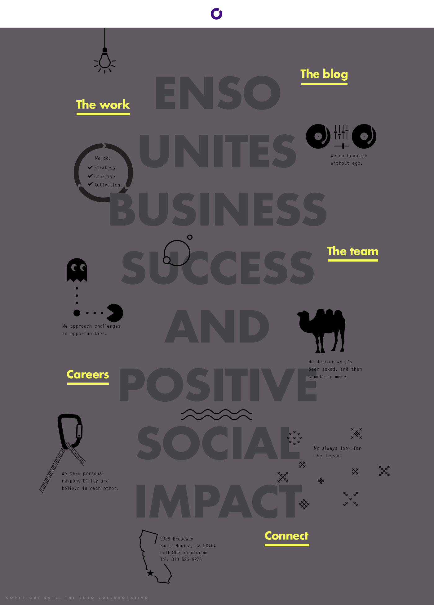
Enso
When I joined as Design Lead in 2013, Enso was a small agency with a mission that stood out to me. Their goal was to create positive social impact by partnering with brands who were starting to recognize that creating positive change with their marketing budgets wasn't just an altruistic thing – it was good for business.
The first order of business was tightening up the branding and translating it into a redesign of the agency website.
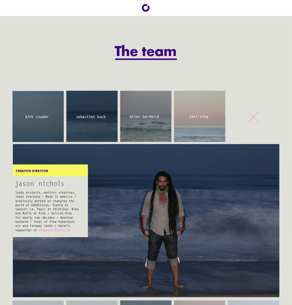
Making the Team page was a lot of fun, and a project in itself. Over the course of a week we had each employee wake up early and come out to the beach. Predictably, some of the best facial expressions came when the icy water ran over our feet.
Case studies were displayed large and clean on a white background. Minimal navigation made it easy to get from one case study to the next, or to simply go back home by clicking the logo.
The launch was a big success — featured on Awwwards, Httpster, CSS Awards and a handful of design blogs including Designspiration. The buzz translated to a 164% increase in traffic compared to the previous month.