

2013-2014
Visual Design, Frontend Dev
Hillary for America
In the run-up to Hillary Clinton's announcement, some friends from my Obama campaign days reached out looking for design help to get her campaign off the ground.
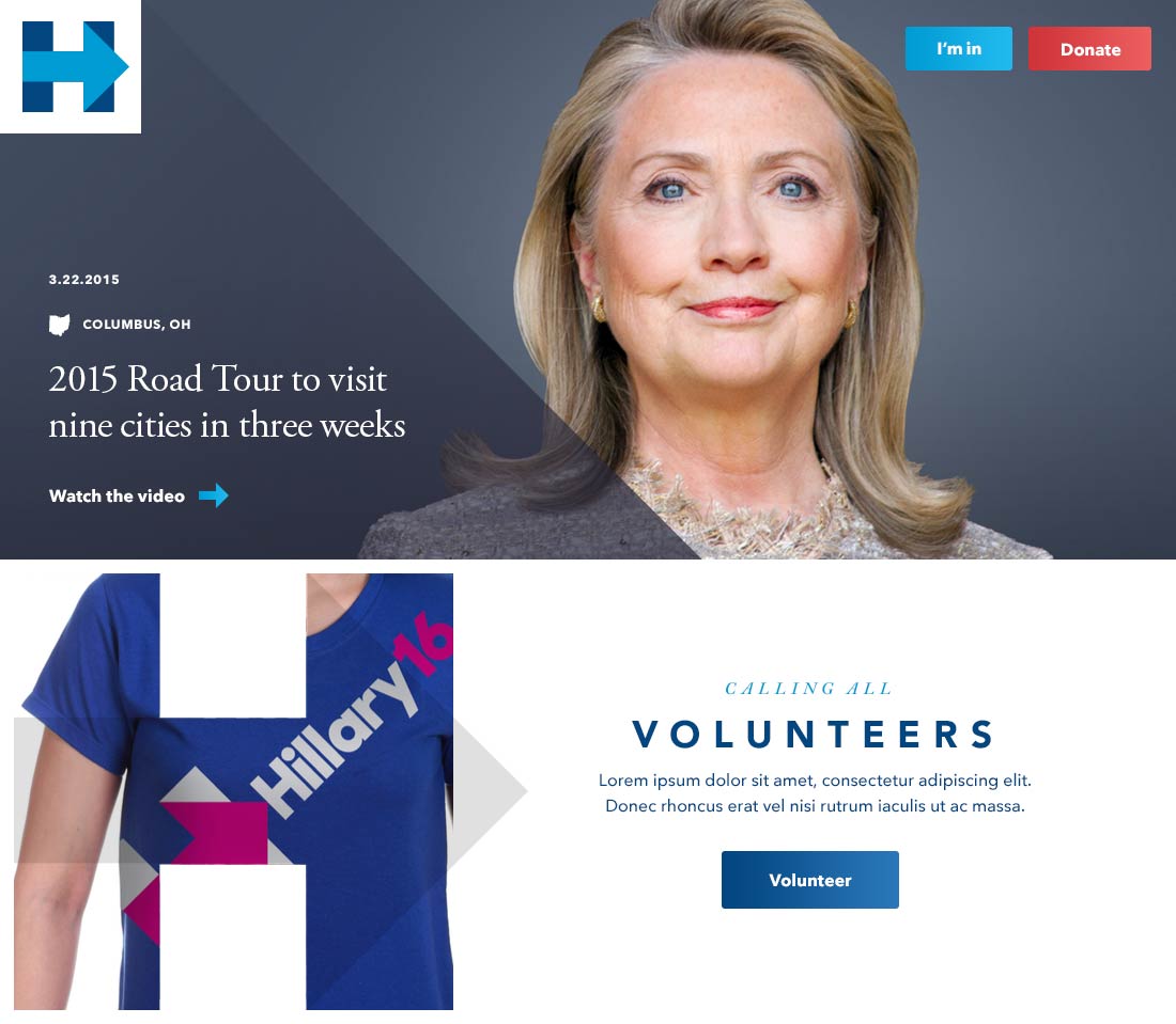
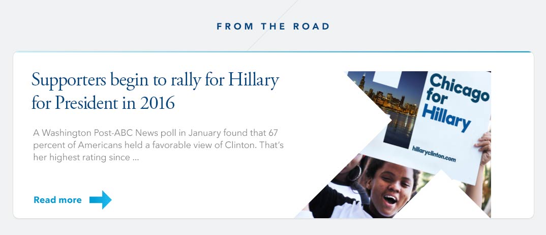
Working with Laura Olin at Precision Strategies, I delivered look-and-feel concepts for the homepage and donation flow. Content strategy was still pretty fluid at that stage, so the exploration was fairly blue-sky.
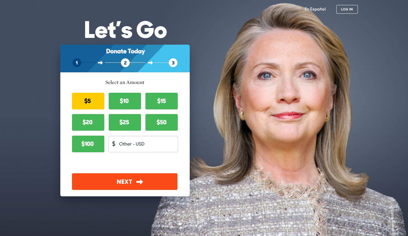
My homepage concepts didn't make the cut, but the donation flow shipped as the first iteration. Shortly after, Hillary for America brought on an incredible in-house design team who took it from there and built something genuinely beautiful. My contribution faded quickly into the background — which felt about right — but I'm proud to have made some small mark on her historic run. Here's some of the work I delivered.
World Food Program
I had a lot of fun designing and building the online annual report for World Food Program. Since the content was divided into chapters, I opted for a scrolling behavior that felt like turning the pages of a large book.
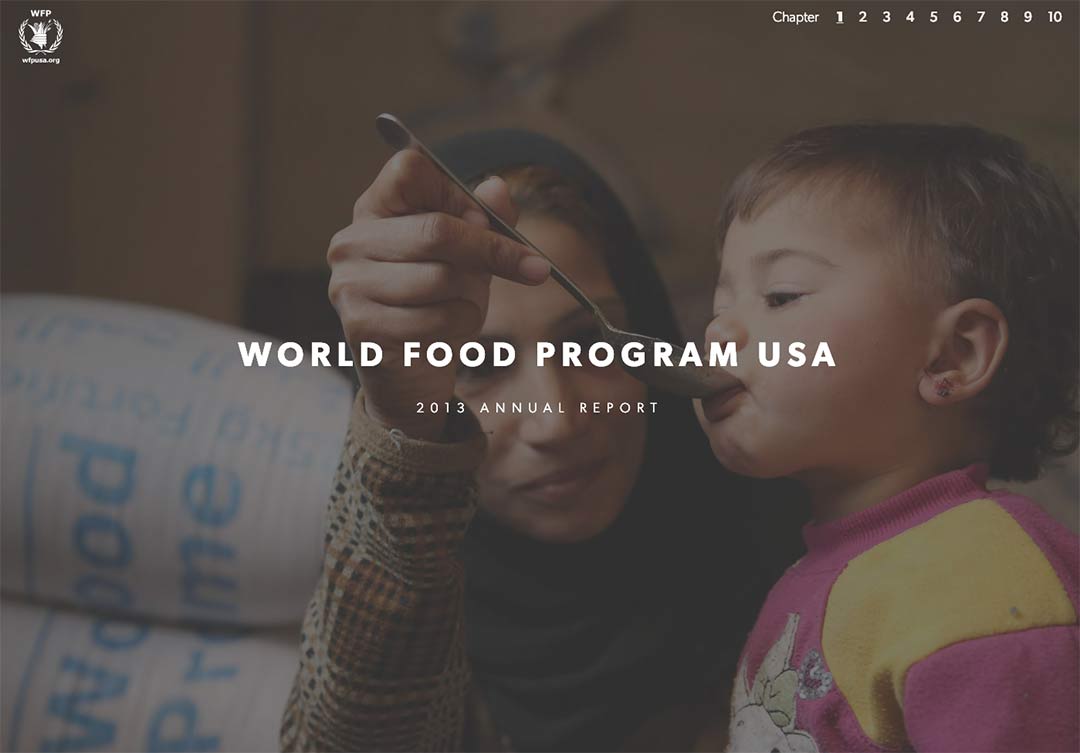
WFP had access to a trove of beautiful and heartbreaking photography, showing the need for food around the globe, and the immense scale of their aid and outreach.
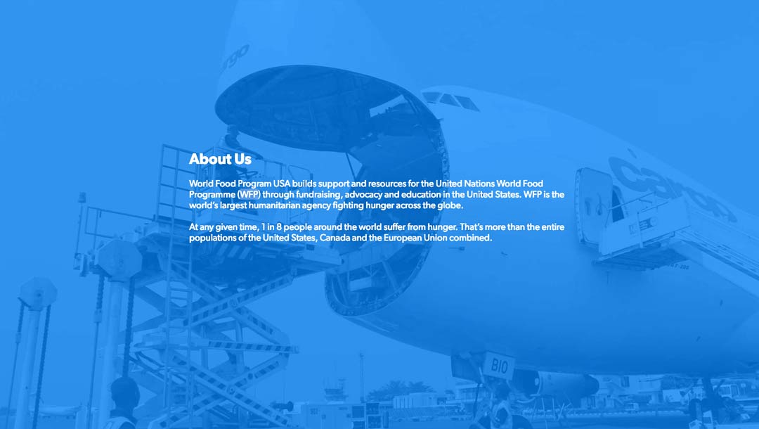
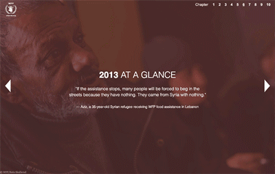
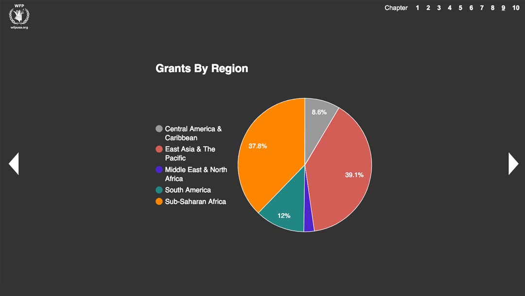
Beyond the emotion, WFP needed hard data — what they'd actually delivered over the previous year. The report included tables, graphs, and an interactive world map showing every location visited and benefited by WFP that year.
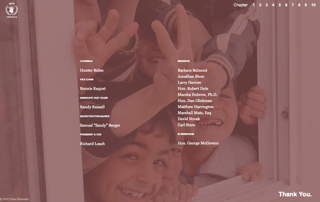
I'm proud to have contributed what I could to this wonderful cause. The project was managed by Lauren Parks and Aliya Karim.