2014 - 2019
Sr. Product Designer
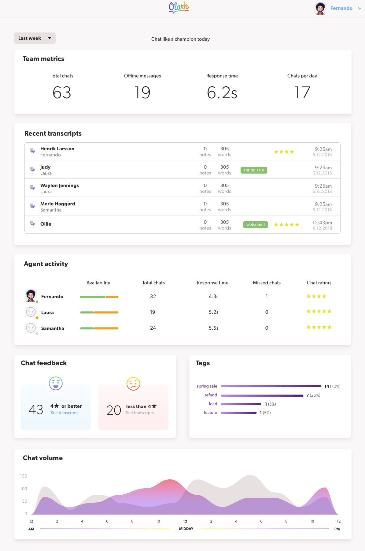
Dashboard
The dashboard project was my last one at Olark, launching in April 2019. An ironic end to my time there in some sense, spending my last chapter at the company working on the first thing our customers see after they log in.
Our goal was to provide more value earlier in the customer's experience — which meant the dashboard needed to be worth visiting whether you had a month of chat data or had never started a conversation.
Here's what the existing dashboard looked like. Effectively, it was the navigation all over again, with a little more explanation around the links. Not a lot of value there:
The old dashboard
To begin, I mapped out a user flow that would demonstrate the value of features whose usage we knew correlated strongly with trial conversion. Things like reporting and analytics, and viewing chat transcripts.
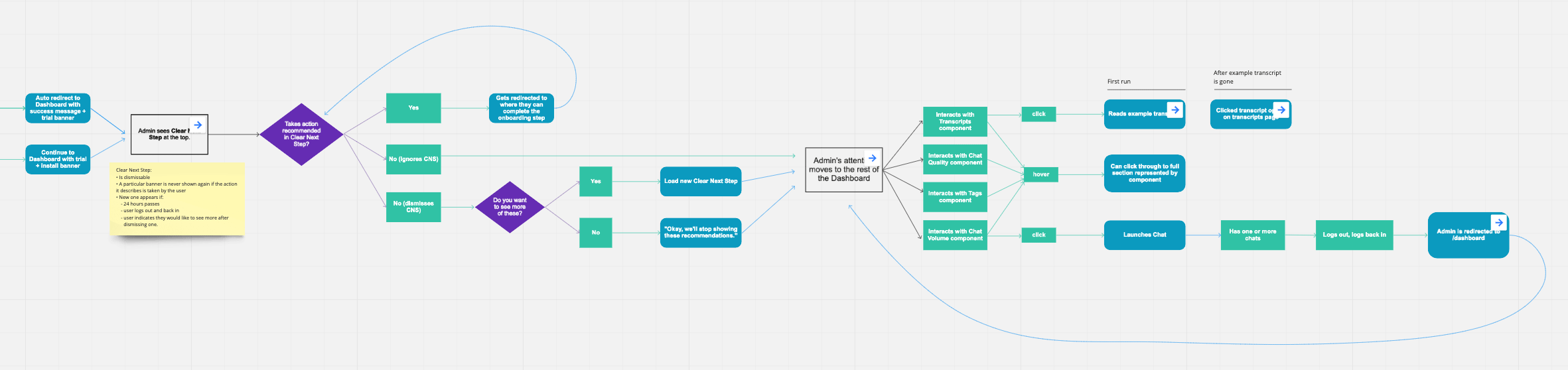
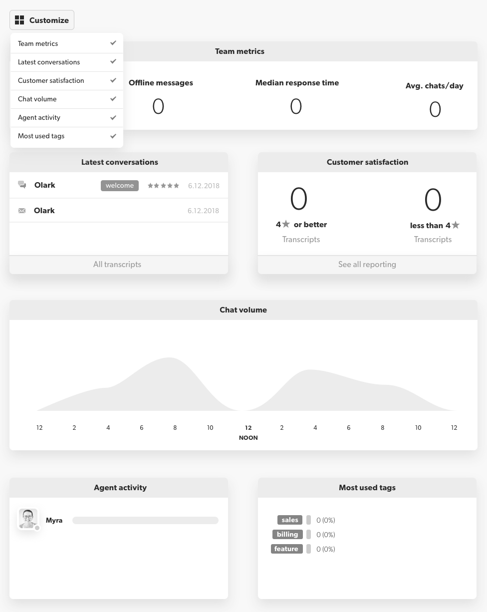
With a path to added value getting clearer, I began prototyping this modular approach that would enable admins to customize their own dashboard, shuffling the components to suit their needs or hiding the ones that weren't as relevant for them.
After working with the project team to scope the work to a specific number of sprints, we were able to make further refinements based on priority. Design specs mapped to user stories (e.g. "As an admin, I can see which agents are logged in now") helped the team build agreement on what things were musts, and which could be deprioritized if time became a factor.
As the engineers turned the user stories into tech specs for the initial build, I refined the prototype and showed it to a handful of current customers with a short list of tasks to catch anything we might be overlooking.
One insight I was able to pull out from those sessions was a strong desire to be able to change the date range that the data on the dashboard would be scoped to. We had chosen 2 weeks as a default, but a lot of folks preferred various ranges for various reasons. I was able to present those findings to the team and eventually get a date range picker option shipped with the beta version. Here's how it looked at rollout:
Brand & UI Design System
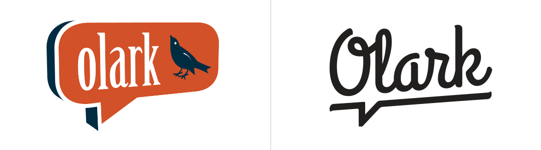
By 2017, Olark had been in business 9 years. With a founding team consisting only of engineers, the brand's look and feel hadn't been given as much attention as, well, more engineer-y concerns.
To begin we needed a north star to guide our efforts. I put together a short survey and sent it out to a cross section of coworkers to get a feel for how employees generally perceived Olark as a brand, what our voice was, and how we'd like those things to be perceived in the future.
From the survey results, I compiled a list of words that people used to describe the kind of company they wanted to work for. When I began tallying words used most often, a theme emerged: Humanity.
When it came to the logo, I wanted to use something hand lettered to capture the human feel. Stakeholders wanted to keep some of the flavor of the original logo, so we stayed with the speech bubble concept and the subtle upward skew.
Another early call: real photography over illustration. Real faces get a reaction in a way that illustrations just don't, and there was a sea of sameness forming around that time with every startup leaning on the same flat vector aesthetic.
The tradeoff was that we'd have to use stock. We didn't have the time or budget for a shoot. Fortunately, I found a portrait set with a backdrop I could recreate, which gave us room to expand it later.

To round out the photography specs in the styleguide, I wanted to create a photo treatment that any designer could use, that would make our lifestyle imagery feel less stock-y and give it all a consistent feel. I settled on a dreamy, almost light-leaky treatment that felt human and warm. I then recorded a screencast tutorial so that other designers would be able to easily apply the treatment.

Next up, we needed a color palette. I'd learned from trying to work within previous styleguides that having too limited a palette led to frustration and an overwhelming desire to use "in-between" colors in certain sitations where the guide didn't spec out something light or dark enough. This was often the case with section backgrounds. To keep it feeling human and diverse, I decided on a full-spectrum palette that would include all colors of the spectrum, rather than honing in on one color that the brand would try to own.
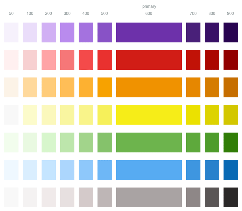
After selecting a sample of colors to be used as "primaries", I used lightness and saturation to create levels within each color, which were used as CSS variables. The lightest shade, {color}50, was typically used as a background color for a section or component.
Another important aspect of the redesigned branding would be vector elements. "Make Business Human" was our new tagline, so it was important to have some consistent pieces that designers could use to convey humanity and business graphically.
With the main pieces in place, I went on to define styling for typography, buttons, forms, lists, cards, spacing and other aspects.
Extensible CSS
Our current way of styling things showed the classic signs of different contributors doing things their own ways over the years. As is often the case when many hands are involved, from one repo to the next you might see Sass, Stylus or vanilla CSS.
We decided to consolidate everything to Stylus and codify the presentational aspects of the styleguide components – colors, shadows, everything except where it goes on the page and the space around it – into base classes.
$card
background-color: white;
      border-radius: 22px;
      box-shadow: $card-shadow;
@extends $card
text-align: center;
To give designers flexibility within the system, I only included the styles in the base classes that I felt strongly would apply in nearly any layout situation, allowing room for overrides in more specific classes.
Check out our public style guide
Simplifying Billing
There's no more sensitive part of an app you can touch than the system that charges your customers money. You can play fast and loose with just about anything else and only receive mild frustration if something goes unaccounted for. Overcharge a customer by accident, however, and you risk being perceived as a dishonest swindler - and word travels fast.
When I arrived at Olark in 2014, Olark was using a simple rails app to handle billing. There soon came a desire to allow customers more options and flexibility over their live chat team and plan, while keeping the cognitive overhead low. This is a screen grab I took of the billing app circa that time:
The old billing UI
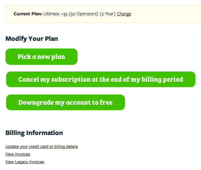
Customers had little control over what they were paying us each month. They could pick from four different tiers of pricing, each allowing a fixed number of agents on the chat team, and some elevated features for the more premium tiers.
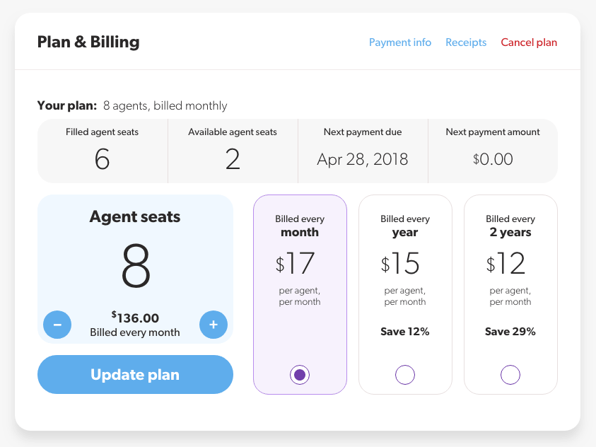
What we found our customers wanted was to pay for only what they were using, rather than prearranged batches of features and agent seats they weren't using. We decided to move to a per-agent billing system, where a customer would needed only make two decisions: how many agents they wanted and how often they wanted to be billed. Everything else would just work.
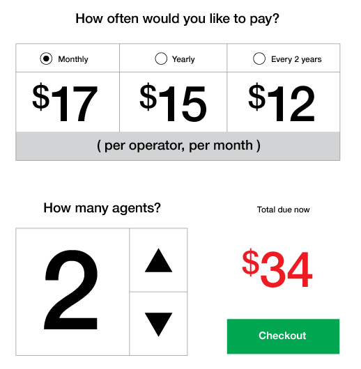
We also added a discount for longer commitments — monthly was a bit pricier than annual or two-year plans. And we wanted to surface the stuff our CS team was constantly fielding: how many seats were going unused, when the next billing cycle started, and exactly what they'd be charged.
Integrations
Olark is a simple yet powerful tool for chatting with visitors on your website, but in order to me more useful to people, it needed to fit into existing workflows. Many of our customers use CRM tools like Salesforce and Zendesk to manage customer relationships over time, and a chat transcript with a customer helps add valuable context to those cases and leads.
For most of 2016, I worked on Olark's Integrations Team, expanding and improving our connections to third-party apps. My job was to design the full catalog experience — how customers would discover, configure, and get value from each integration.
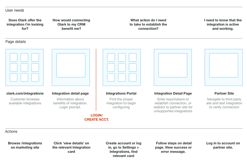
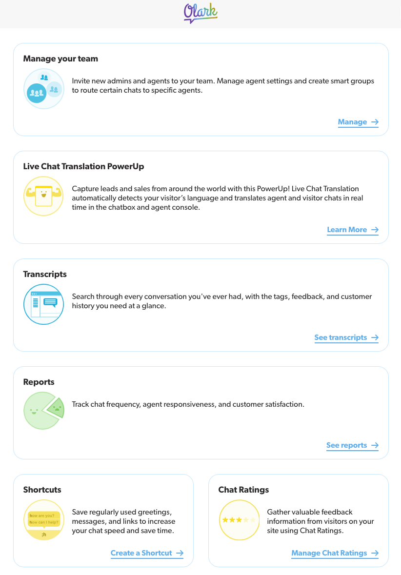
After wireframing the flow to better understand how user needs would map to page states, I began exploring layout options that would give a summary of the benefits of each integration option in an easily scannable menu.
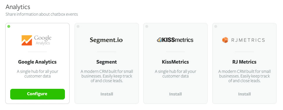
That early layout made it easy to see what was connected and how to configure it, but as the list grew we weren't confident people could actually find what they were looking for.
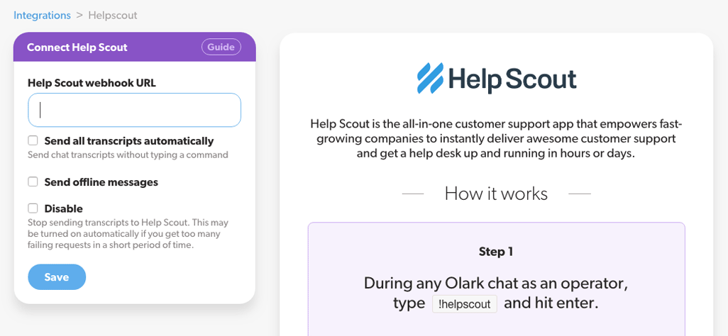
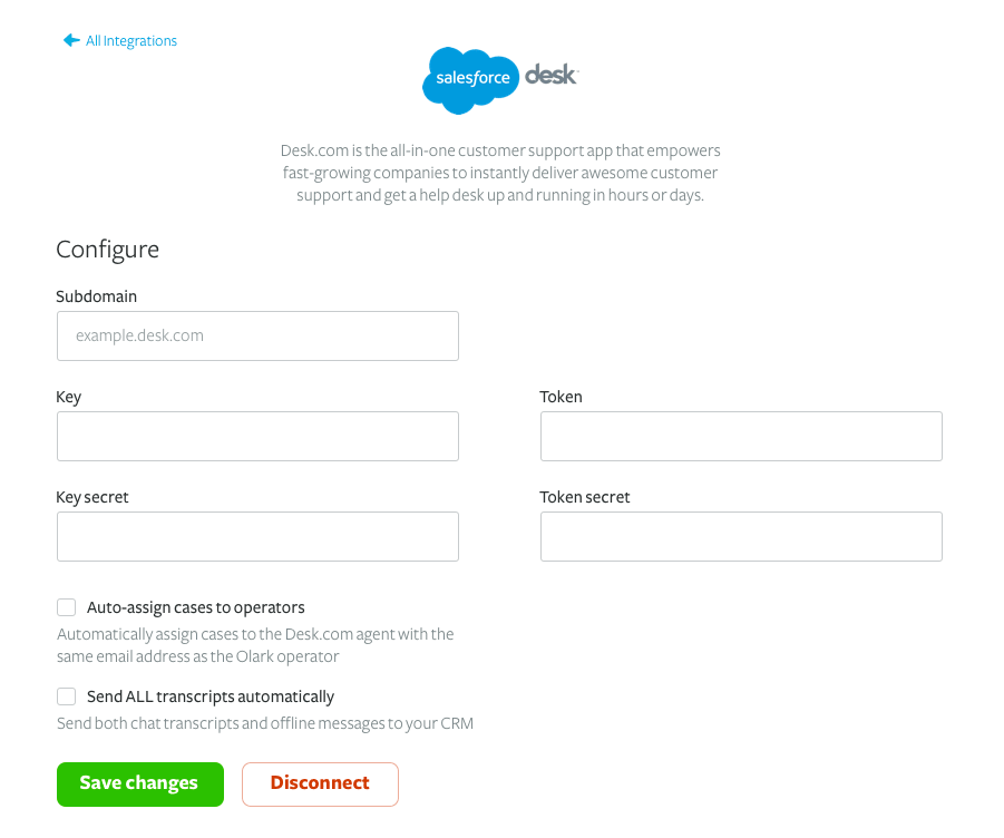
In parallel, I also began defining the experience of configuring each individual integration. An early idea looked clean and simple, but I wasn't satisfied with the side-by-side layout of the form fields. It looked like too much work compared to a single-column fieldset:
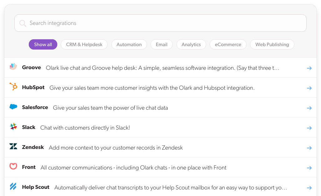
Wanting to make the portal page easier to scan, I tried a list layout instead of a grid and found it made a world of difference. We then added search and filtering by integration type to make it a snap to find the app a visitor was looking for.
For the configuration pages, we landed on a side-by-side layout: a clean single-column form on one side, a step-by-step visual walkthrough on the other. It let us sell the value of the integration while making it easy to actually set up.