2011-2012
Sr. Design Lead
barackobama.com
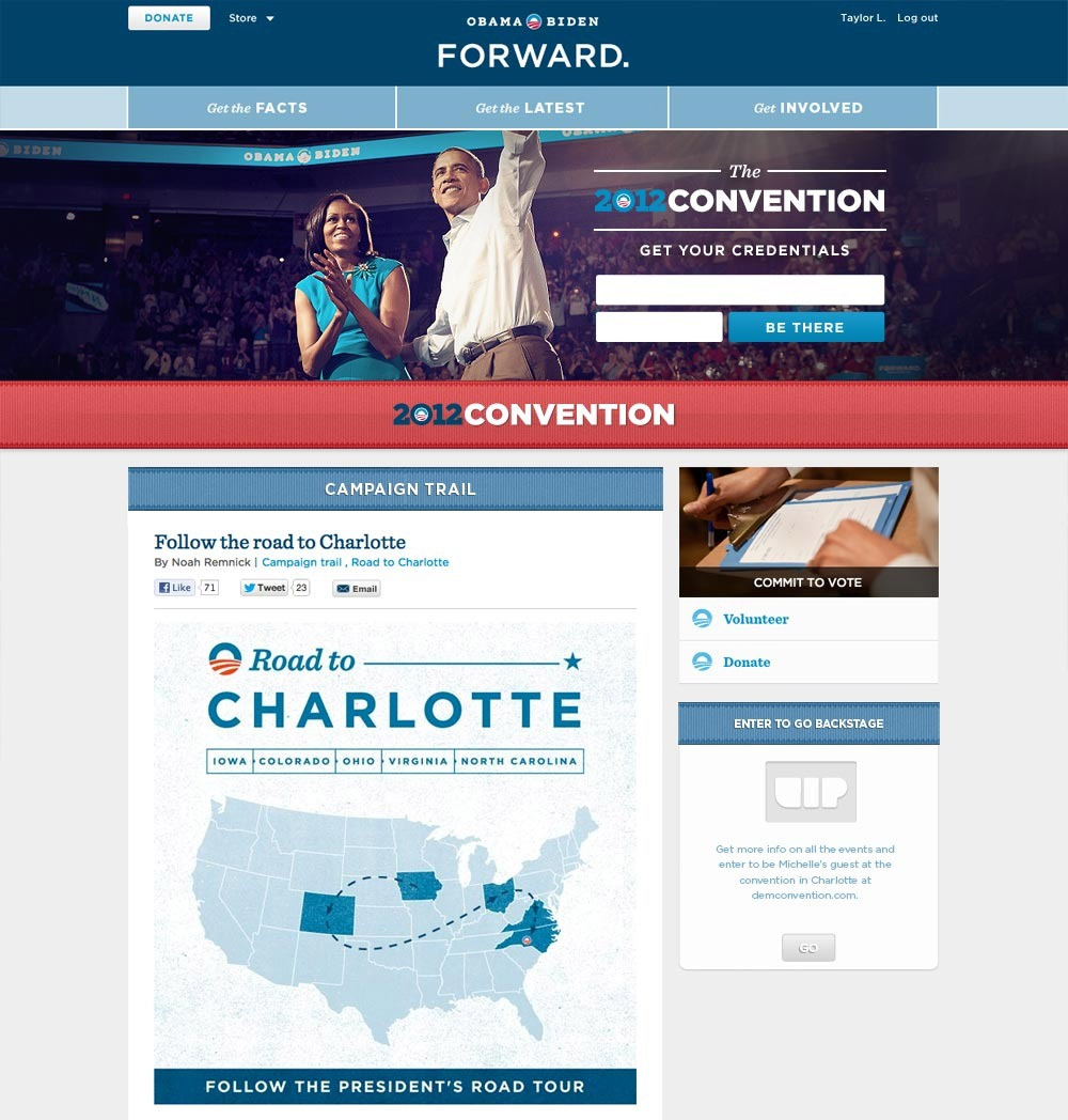
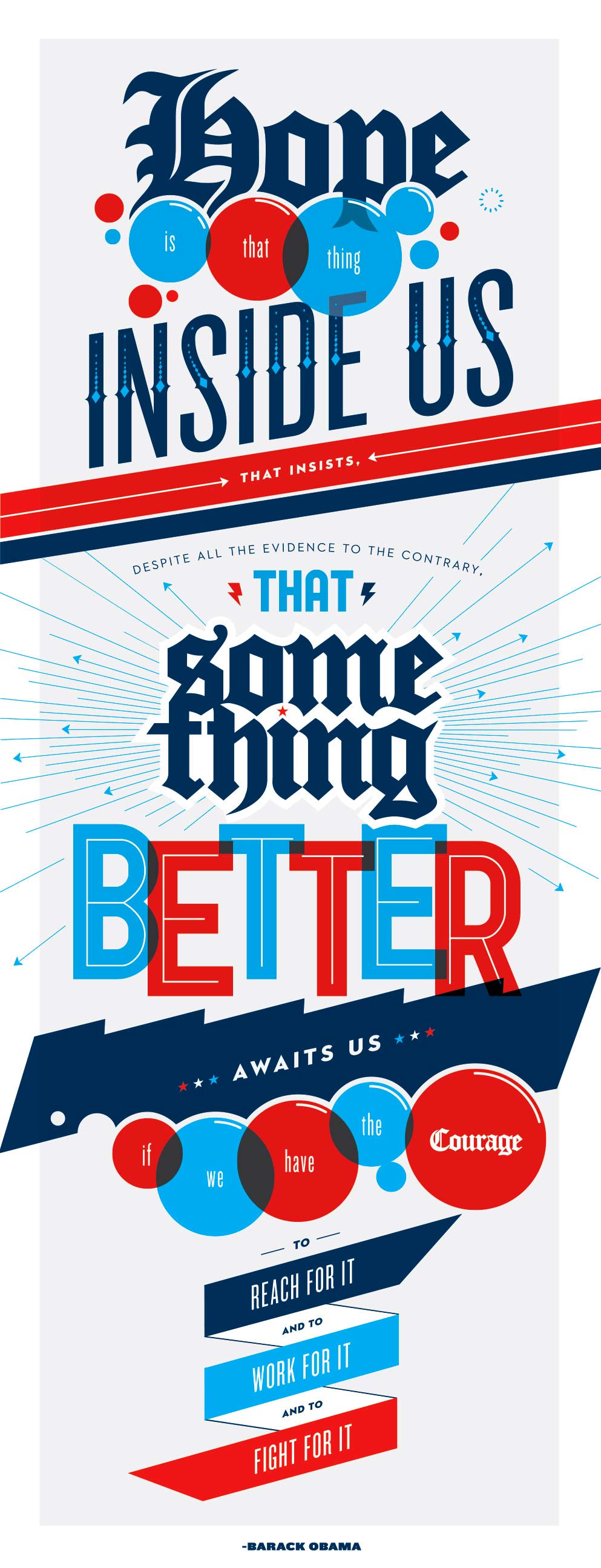
"I want you to redesign barackobama dot com." I'll never forget hearing Design Director John Higgins say that to me. It hit me in stages — first, 'What an opportunity!', then almost immediately, 'If I screw this up, it will be the most profound failure of my life.' So, y'know. No pressure.
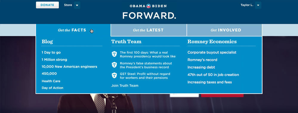
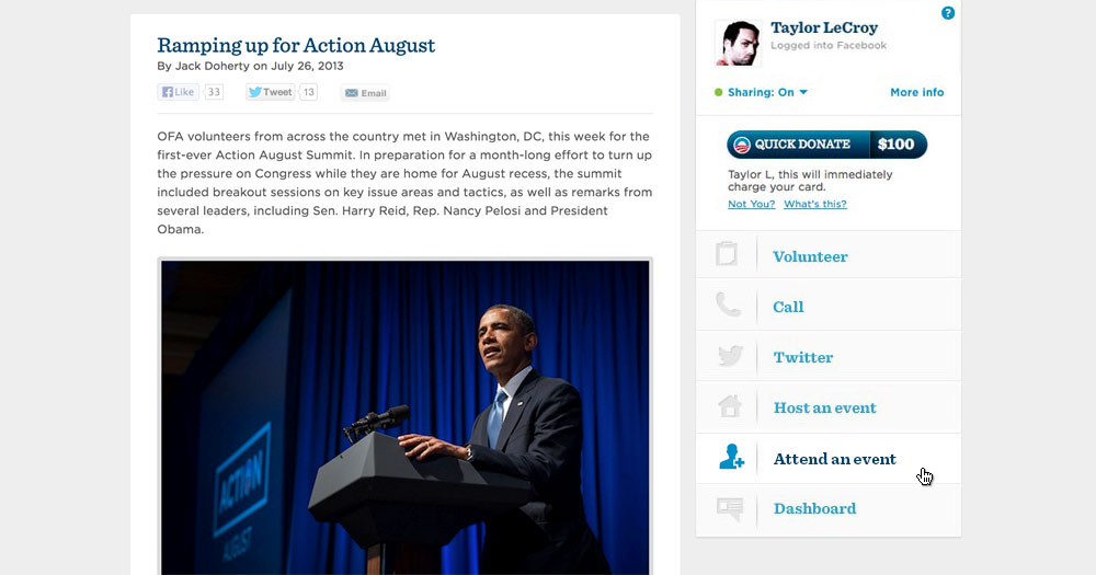
With accessibility as our North Star, we organized the most basic levels of engagement into three clear buckets: "Get the Facts", "Get the Latest", and "Get Involved"; creating a minimal header that left little room for confusion.
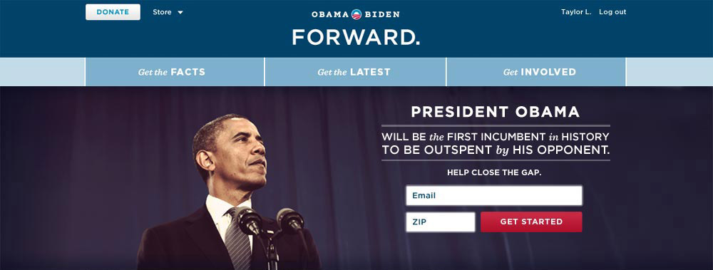
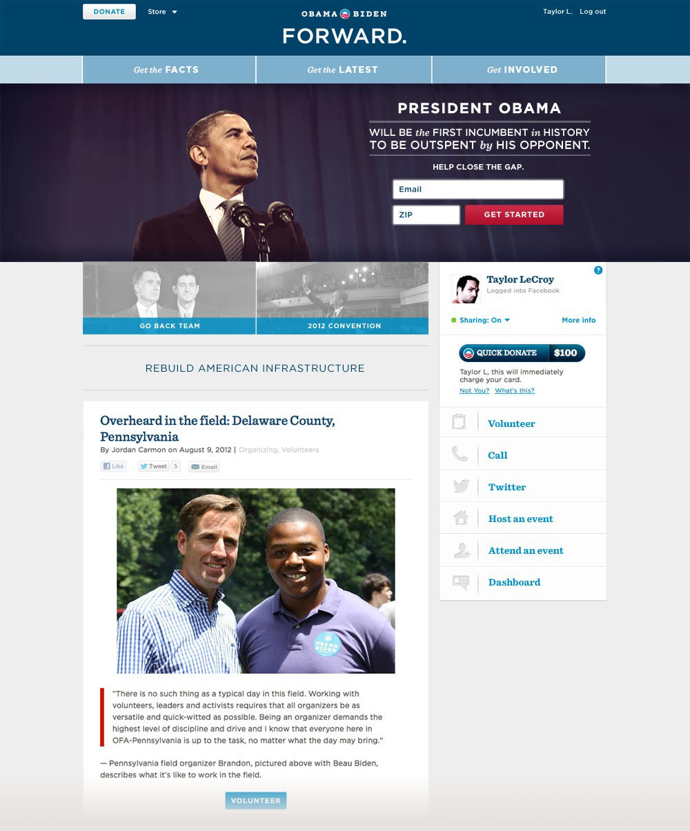
The header needed to accommodate several featured items at once without everything fighting for attention — the top story always won. Below the hero image we carved out space for secondary topics and a quick read on the President's positions, with the sidebar dedicated to donations, social sharing, and ways to get involved. Scroll down and a cascade of recent stories gave you more to dig into or share.
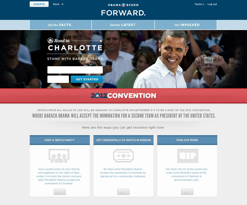
For major events like the convention, we were able to execute page takeovers in hours thanks to an always-on frontend development team.
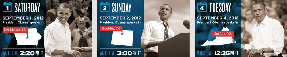
Templates had to accomodate any location, date and time while staying true to the brand look and feel.
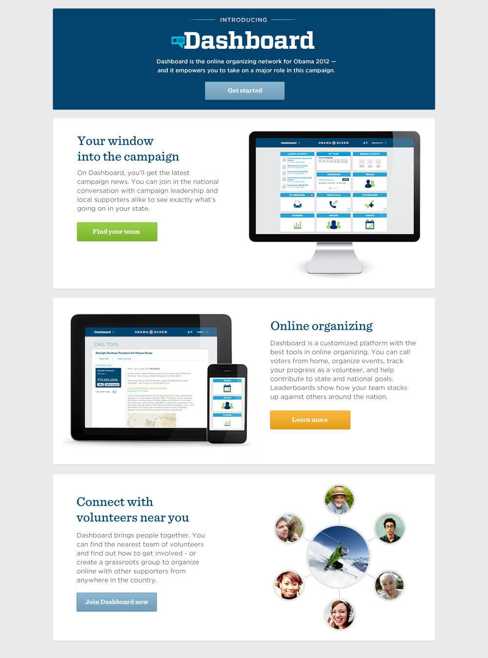
Dashboard
On the morning of my third day at the campaign I was walking to my desk when someone stood up and introduced himself. His name was David Osborne, and he was the Product Manager on something kind of secretive which at the time was being called WIRE. Someone had told David that I was the new digital designer who could handle the project, and I was happy to play along. What followed was a year and a half of daily check-ins, genuine blood sweat and tears, and three complete CSS rewrites of production code shipped to hundreds of thousands.
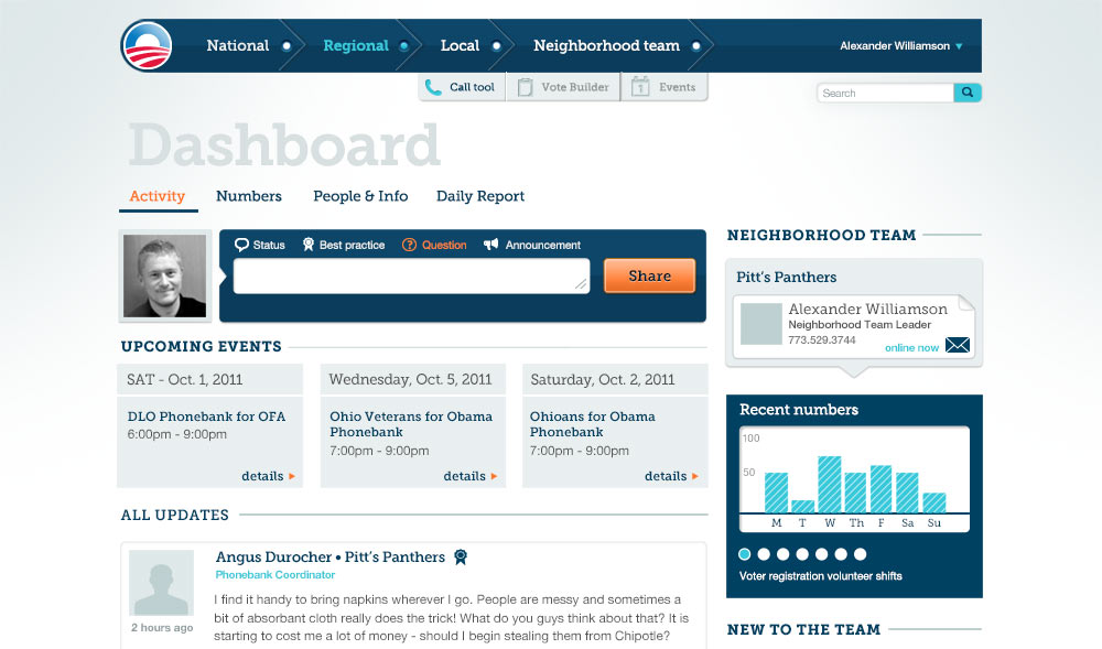
The goal of the project was to organize the campaign's massive ground network of neighborhood teams into a centralized digital hub. They needed to be able to do everything they could do in person, but quicker and easier, and it needed to work for grandma just as well as a tech savvy college student.
After a lot of wireframing, whiteboarding and general back and forth we finally arrived at an MVP which we rolled out to Iowa volunteers as a beta. It was based on a National > Regional > Local navigation model and looked something like this:
And boy oh boy, did they hate it. We frantically tried to identify and address the most important issues through a small but tireless support team that had tickets pouring in left and right. Volunteers were threatening to dump the product and go back to Excel spreadsheets, and stakeholders within the campaign were getting restless.
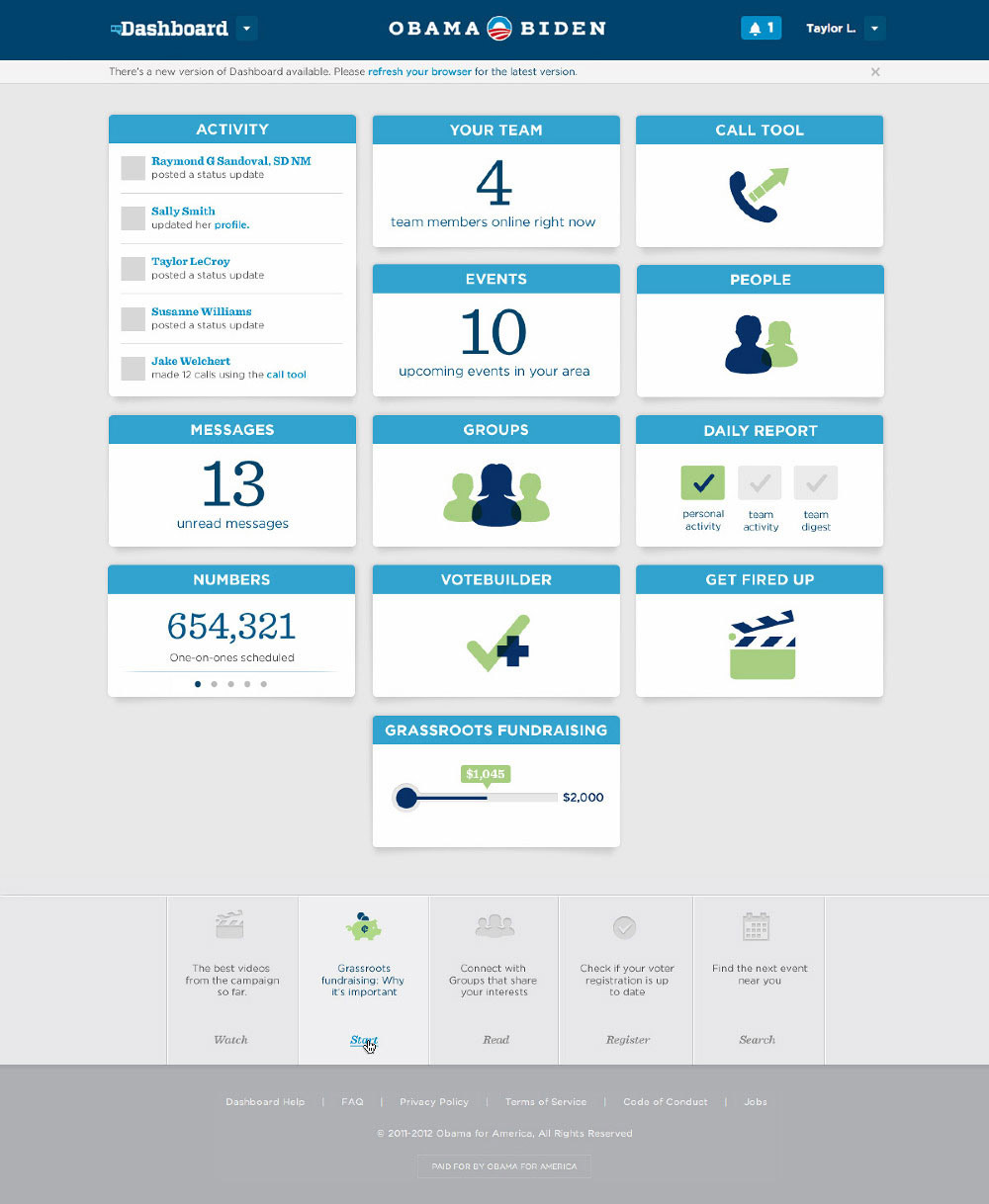
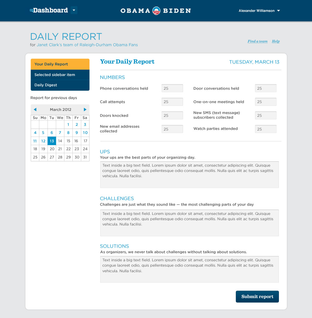
So we did the only rational thing and scrapped the entire codebase and started over. We flew in volunteers and team leaders who needed to use Dashboard and did videotaped sessions right at HQ. We decided to take an entirely different approach to the navigational structure, arranging the different tasks and displays into a grid of tiles, many of which would display live data akin to a traditional dashboard. Once clicked, the tiles expanded into deep dive views of the various sections, all tailored to the user's position within the network.
One big feature that had to get done as soon as possible was the Call Tool. We knew that if we could make the experience of cold calling a stranger a little more comfortable, we could move the needle for the President in a big way.
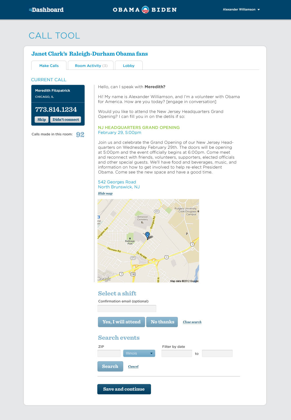
I wish I'd saved screen grabs of the previous version. Picture a usability nightmare that you had to squint to read, cluttered with confusing options. The redesign would live as a feature within Dashboard rather than a standalone app, so the visual language had to match.
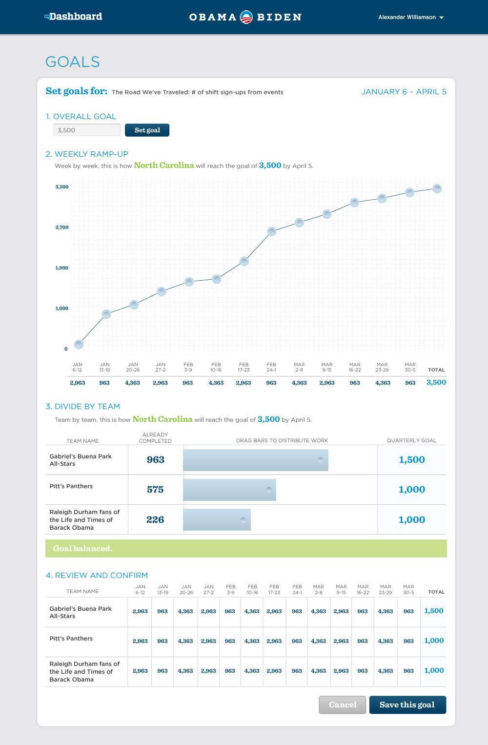
Most of the work volunteers were doing on Dashboard involved reporting and recording data so that regional managers could easily see which teams or team members were performing well and which needed shoring up. The tricky part was that what you saw on Dashboard depended heavily on where you sat in the org. Below is the goal-setting view for a regional manager — draggable points on a graph let them spread a total goal across weeks however made sense for their team.
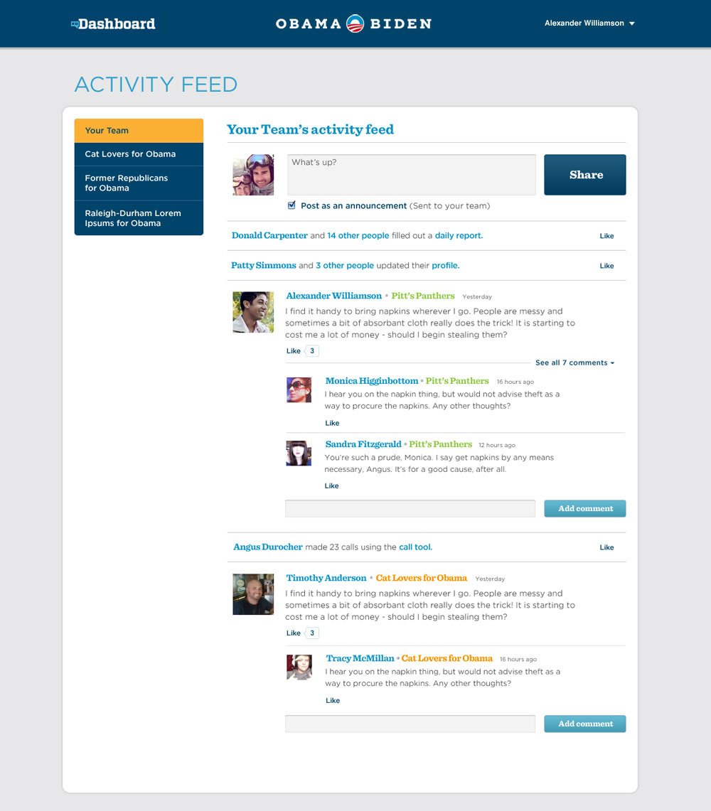
At the same time, neighborhood-level volunteers needed a way to report their daily activity up the chain, including general commenting fields to describe what was working for them and what wasn't. A different tile housed an activity feed for communicating directly with other members of your neighborhood team.
All told, working on Dashboard is probably the most fun I've had working on any one project. There were many hard times and a lot of pressure, but in the end we had over 300,000 unique accounts doing work daily to help the reelection effort, and I believe it made a difference on election day.
Microsites
A major presidential campaign has a lot of moving parts — field teams, surrogates, opposition research, and plenty more. Each department had its own needs, and more often than not, those needs included a website. Following are several microsites I had the opportunity to design.
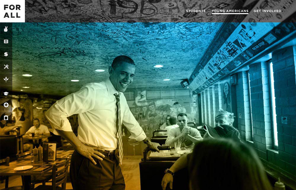
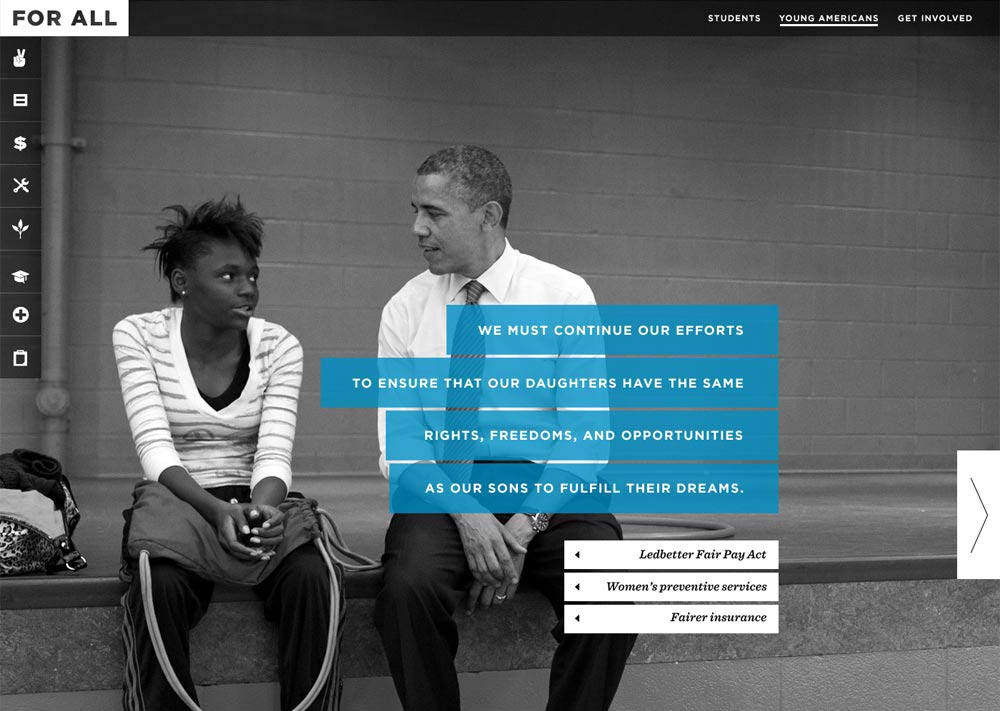
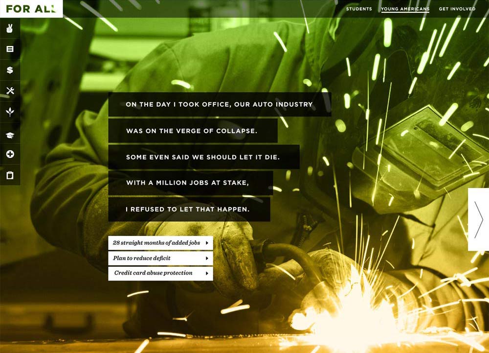
Young Americans for Obama
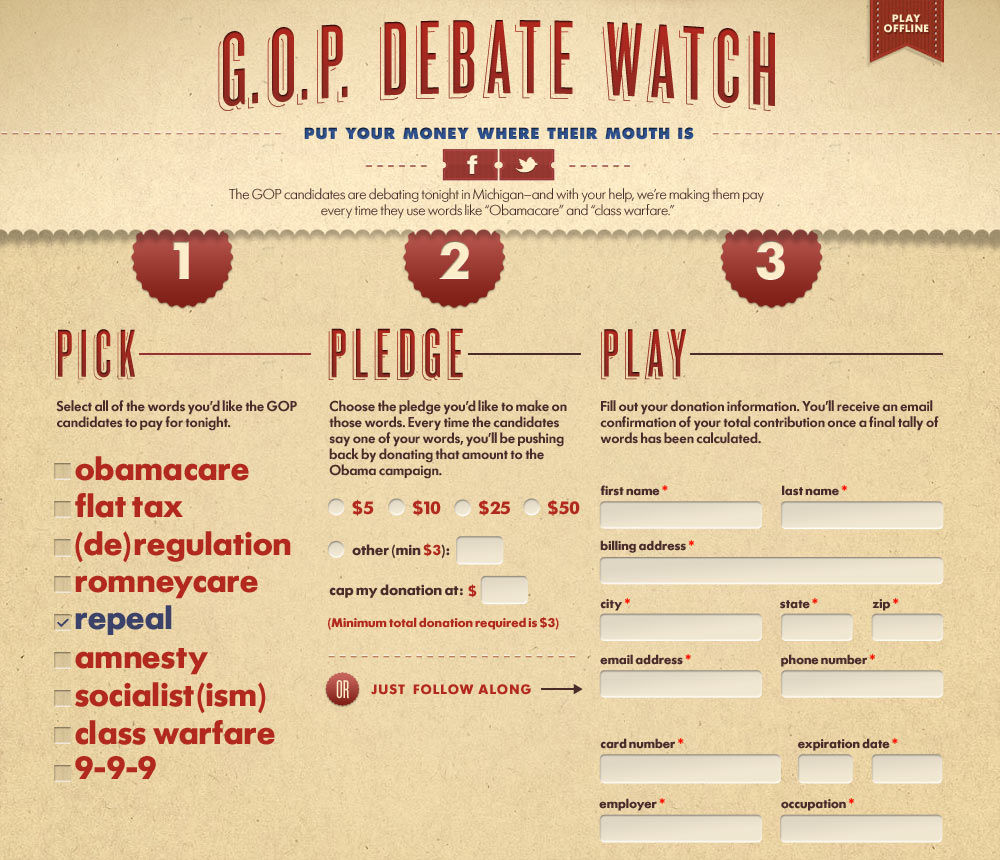
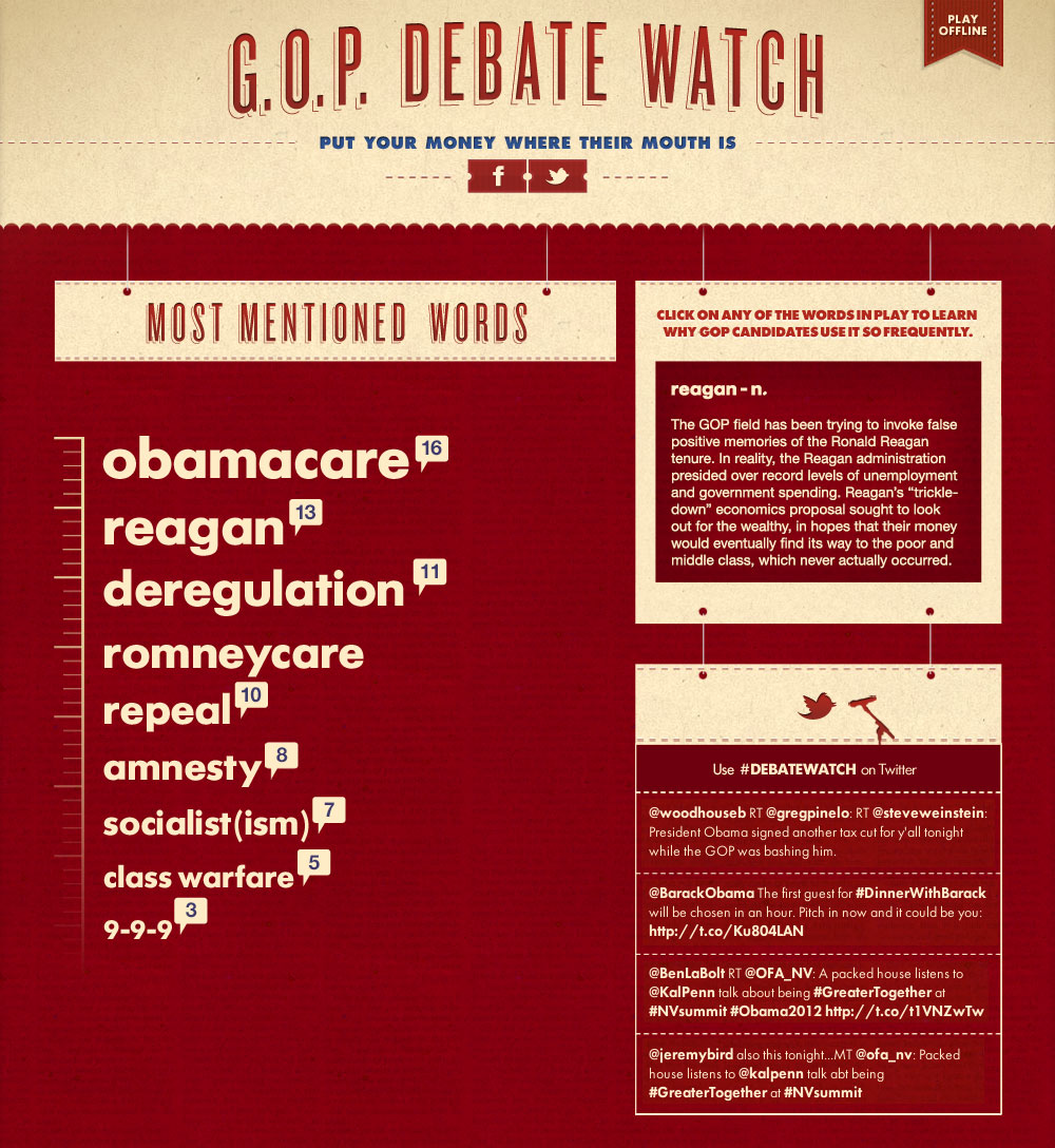
Debate Watch
One of the more fun projects was a website that asked visitors to pledge a donation for each mention of certain buzzwords during the Republican debates leading up to the nomination. During the debates, results updated in real time with each buzzword mention.
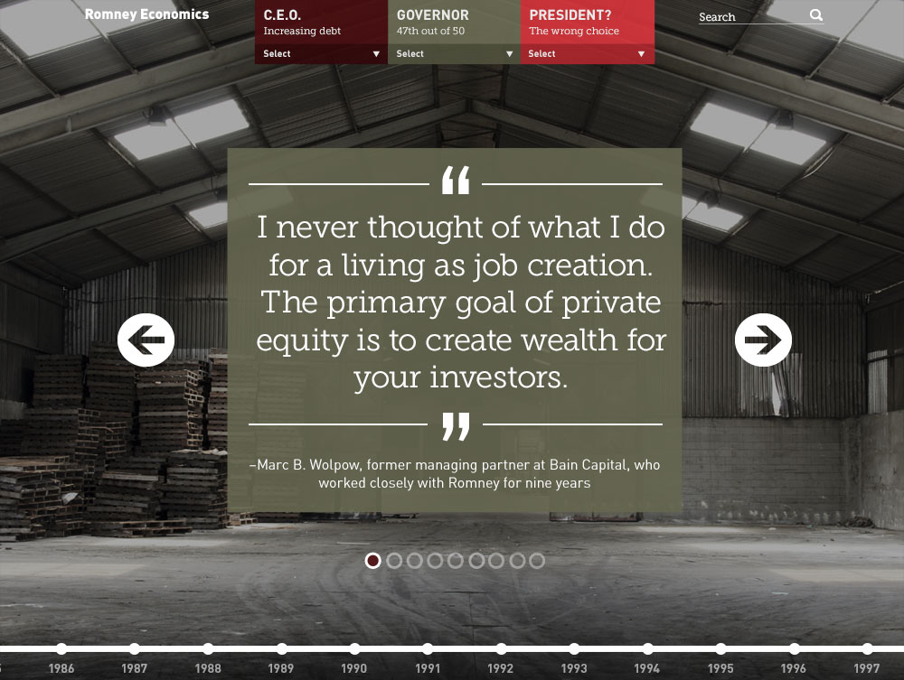
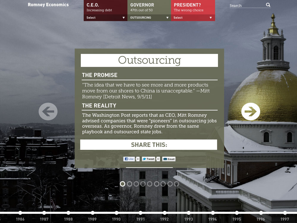
Romney Economics
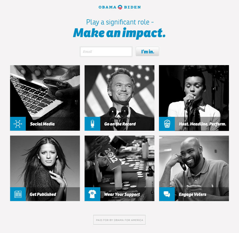
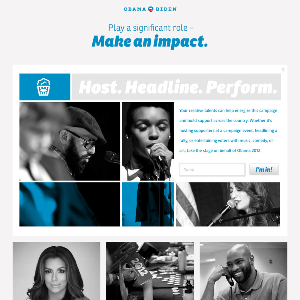
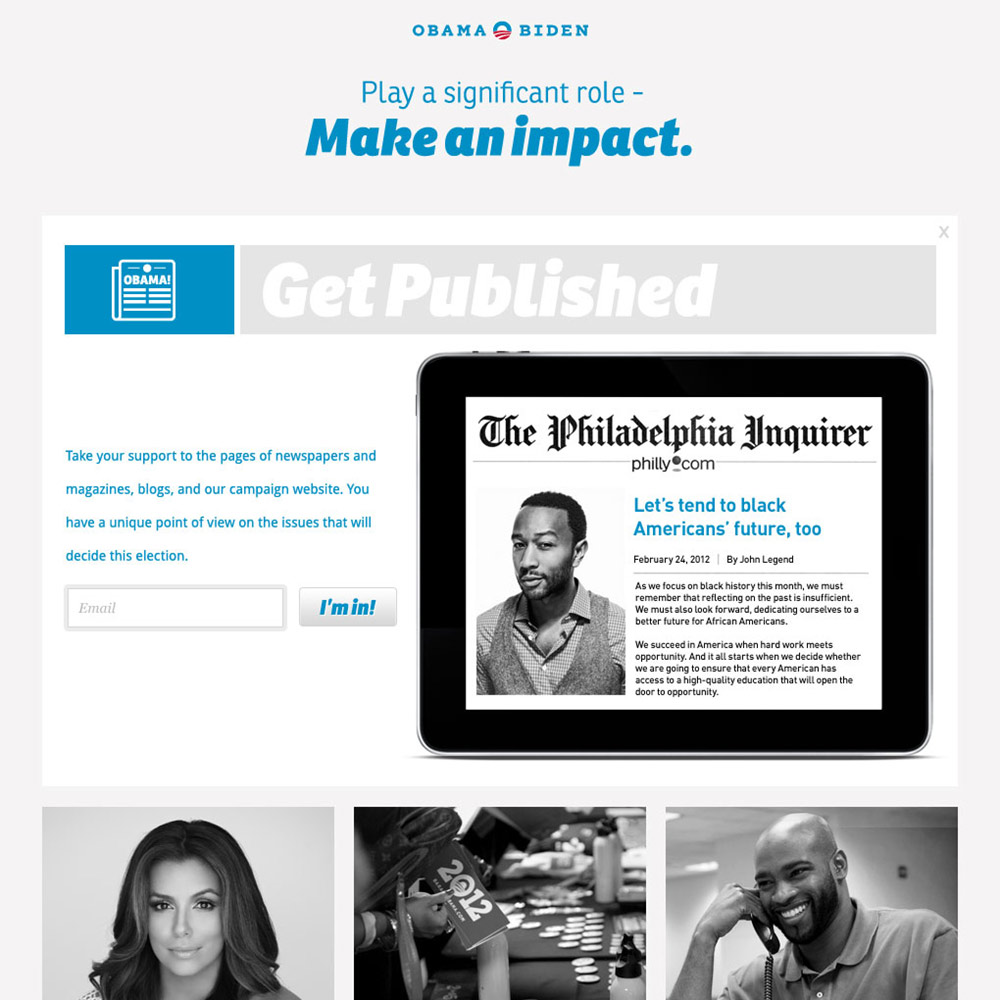
Influencers for Obama
In the political world, "surrogate" is the word for a celebrity who endorses a candidate. We were fortunate to have a who's who of a-list surrogates backing the campaign, and needed a website just for them, packed with ideas about how they could use their celebrity as a platform to add momentum and rally fans and followers.
Posters
Working at the campaign wasn't all web stuff for me. I got the chance to help with graphic design as well. Here are some posters I made during my time there.
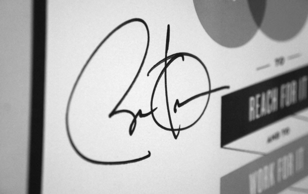
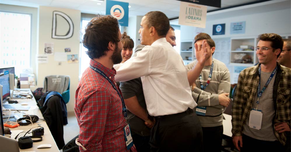
On one of the President's visits, Design Director Josh Higgins surprised me by having him autograph one for me.