

2020-2022
Sr. Product Designer
Selling a vision through signup
It was Spring 2020 and Mural was growing. Quickly. The pandemic had accelerated remote work and, nearly overnight, every company needed a digital whiteboard to keep collaboration flowing on their newly distributed teams. As a product geared toward remote collaboration, we needed to meet the moment.
Internally, we began working toward what we called "lightning strike" moments - big, news-worthy releases to wow our users and position ourselves as first-class player in a newly coined category: Collaborative Intelligence.
In my corner of the product — Growth and Acquisition — that meant owning the seam between the marketing site and the user's first product experience. Our mandate: rebuild the signup flow from scratch to match the new brand direction, and make it feel like it belonged there.
The problem
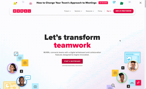
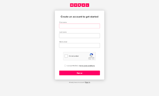
Put bluntly, the signup flow simply didn't live up to the promise of the marketing website. Where was the collaboration, the movement, the color? It felt like a different brand and company.
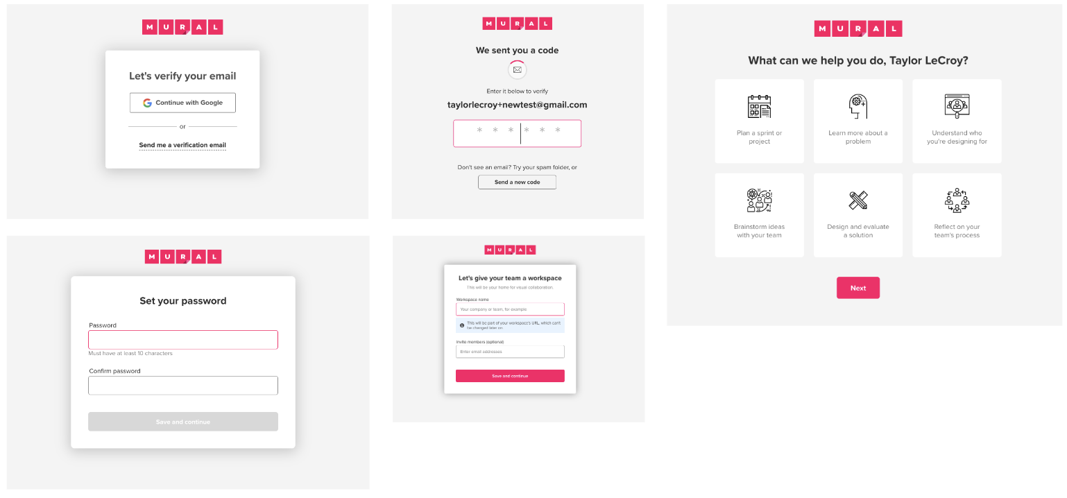
It wasn't just the first step either. The entire flow followed the same lifeless theme:
The design approach
We had to get this right, and the stakeholder map was wide and convoluted. I needed to break this down into manageable steps and begin to move the team forward.
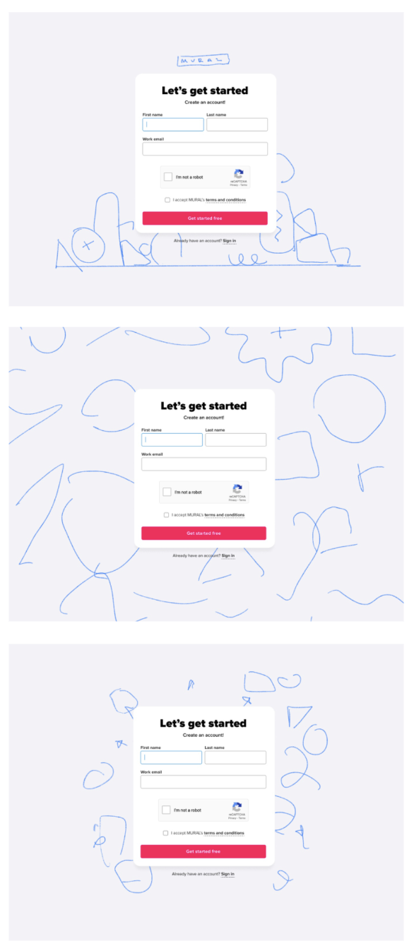
First, we needed to align on the voice and tone of this flow. We had the beginnings of a visual style emerging from the brand team, but we needed to decide what aspects to bring into the signup moment specifically. Running some casual brainstorming, we aligned on a tonal direction.
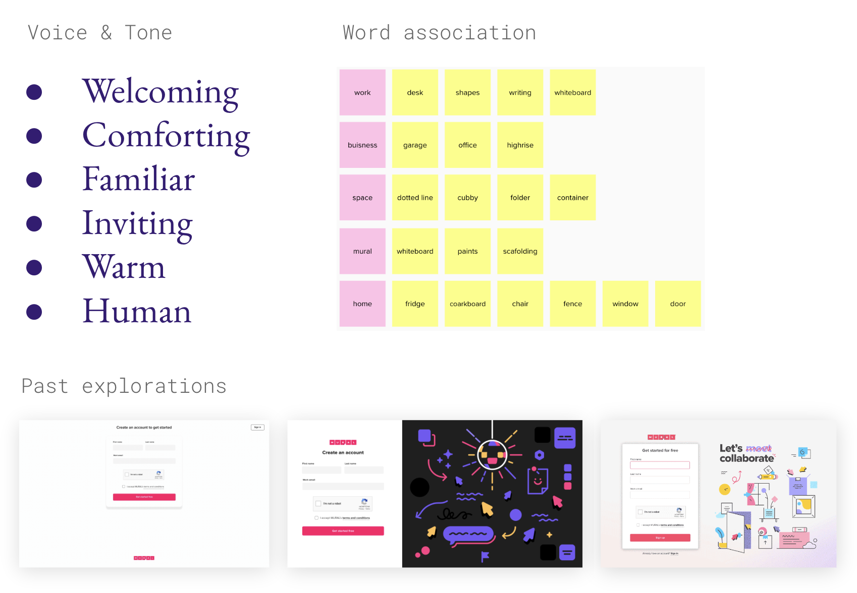
Inviting. Familiar. Warm. These are the feelings a proper signup experience should invoke, within the constraints of a fun and energetic brand.
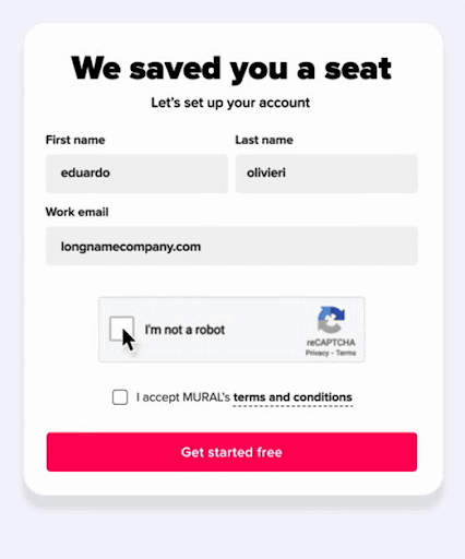
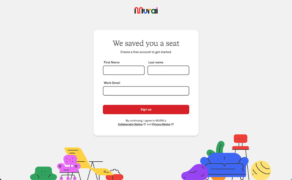
From this initial decision, a visual metaphor started to emerge. Signup should feel like an invitation. Come in. Sit down. Stay awhile. "Seats" aren't just a SaaS pricing unit — taken literally, they're a place to belong.
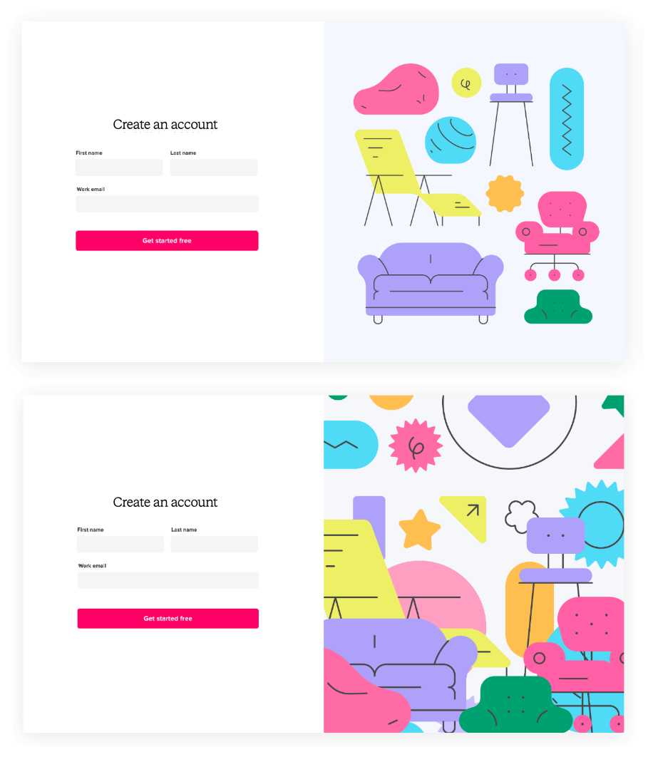
Next, we needed to land on a composition and finalize the visual hierarchy. In our case, grounding the illustration at the bottom of the viewport made conceptual sense with the chair metaphor, and allowed for easy adaptation to a single-column mobile layout.
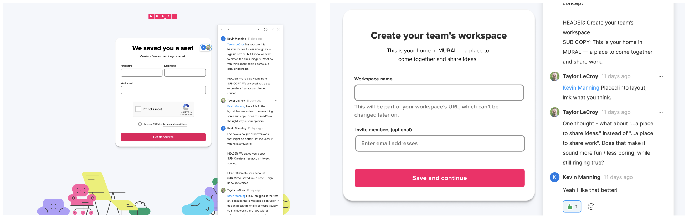
With the visual design taking shape, I worked closely with our Content Design team to nail the language. Getting the words right — and making them feel like they belong with the visuals — matters just as much as the design itself. Probably more, honestly.
While I ended up leaving Mural before this work shipped as part of the company-wide rebrand, and thus can't speak to its impact, I'm proud of where we ended up and think the flow looks fantastic in production today. It lives up to the promise of the brand and website and keeps the user engaged and interested as the product makes its ever-important first impression.
Onboarding for better retention
Another project I'm proud of from my Mural years is the work we did to get new workspace creators to the Setup Moment – defined as “Creating a new mural with relevant content” – earlier in their journey.
The problem
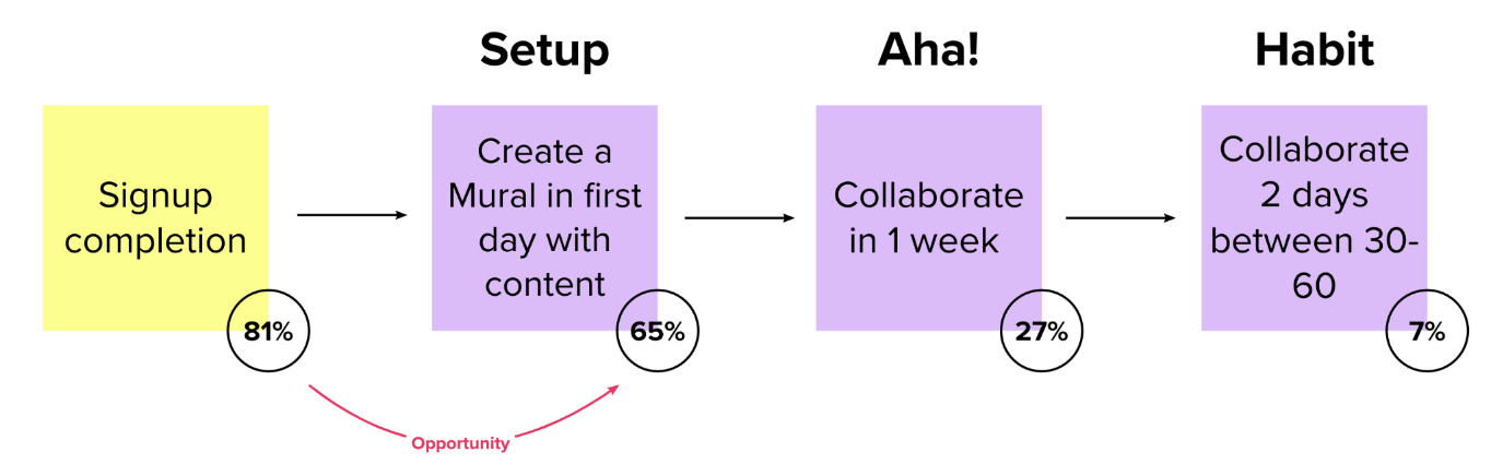
The data told us that 81% of new signups created a mural within their first day, but only 65% added any content to it. The goal: help new creators build something they were actually proud to share — and get there faster.
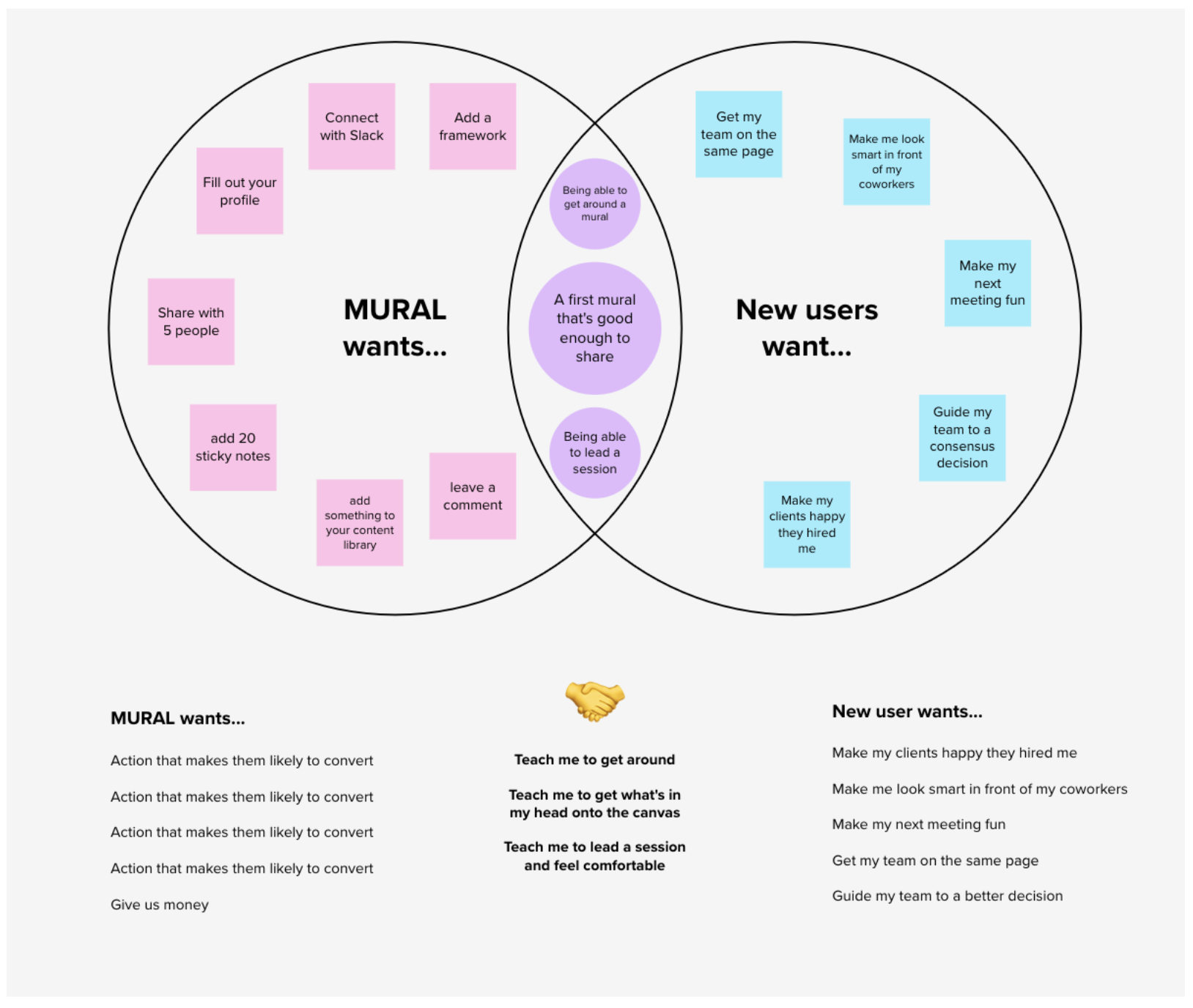
This needed to be more than just making the share button bigger or adding a standard product tour. It wasn't enough to make sharing easy – creators had to want to share their mural. And in order to achieve that state, they needed to be proud of what they were sharing.
I had some quantitative data to go on related to user activities correlated with retention, which would help inform a solution eventually, but a simple heuristic review of the onboarding process revealed a glaring clue: We weren't answering the question "What now?" at the end of our onboarding flow. It was a very sink-or-swim feeling.
Based on what I'd discovered, my hypothesis was “We believe if we recommend next steps to new creators entering their first mural, they will create a mural they want to share during onboarding, and therefore reach the Setup Moment on day 1.” We'd measure success based on an increase of new creators reaching Setup on day 1 by 10%; with 1-day and 1-week retention serving as secondary success metrics. The next step was to identify many different ways to move the needle on those metrics and weigh their trade-offs.
A colleague once explained his view of product design process, saying "You're always either making a mess, or cleaning one up." In this case, it was now time to clean up the mess of sticky notes and sketches we had on our brainstorm canvas, and start to synthesize the output. I typically do this by grouping similar ideas and themes and then putting a low fidelity mockup against each. This allows for a followup discussion about what will most likely move the needle with as little cost as possible.
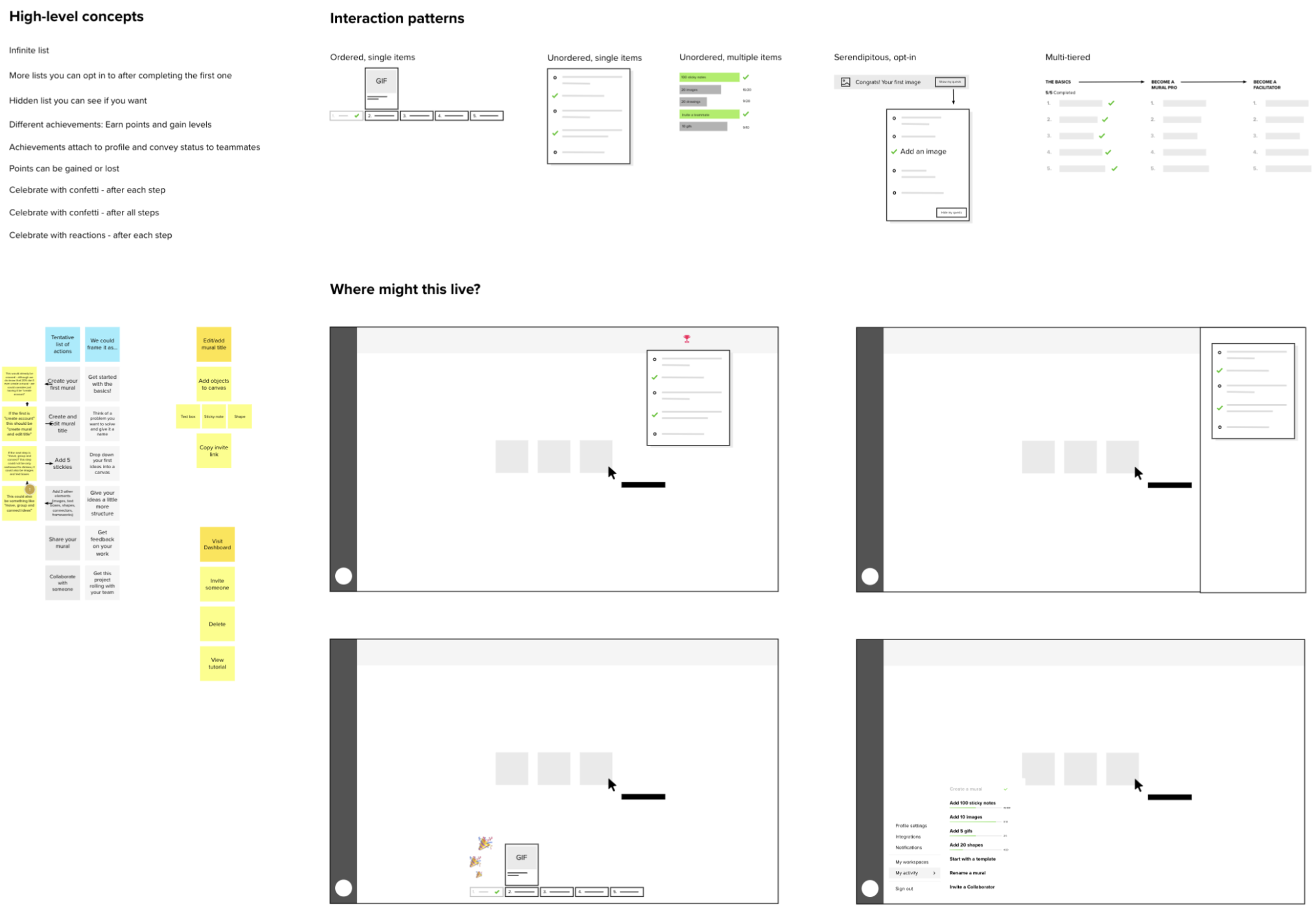
After regrouping with a Product Manager and Engineering lead for input on value and cost, respectively, it's time for my favorite part of the process: turning the abstract into something tangible using rapid prototypes. There's no substitute for putting something visual into the team's hands that we can start to mold into the right thing that properly fills the shape of the problem.
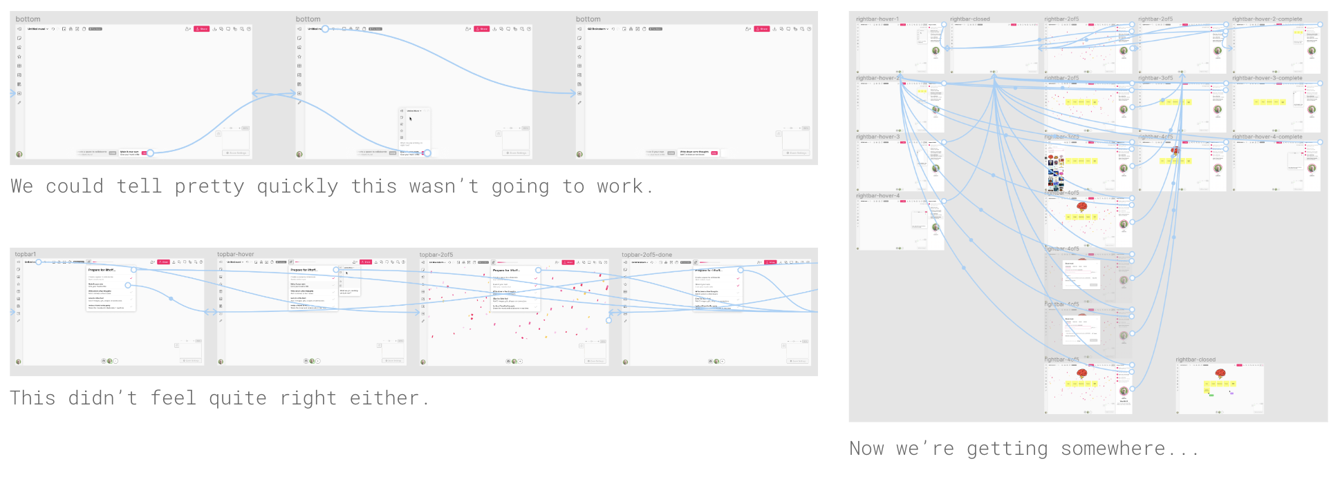
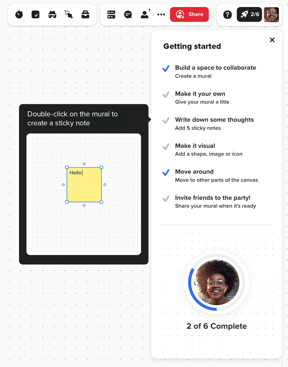
With the ability to interact and iterate with prototypes, we zeroed in on an interactive checklist that would live in the canvas when the new user lands for the first time. The items on the list were the ones that helped new users get acquainted and begin building a mural they were proud of, while kicking the tires and exploring at their own pace. They were also actions that correlated strongly with retention.
The onboarding checklist experiment proved effective, increasing 1-day retention by nearly 29%, and 1-week retention by 11%.